Bright colours for a bright new future.
Challenge.
Despite the brand’s immense popularity and recognition, the Unitel leadership recognised three key issues that required attention:
- Since its creation, the brand has become somewhat outdated;
- The business had expanded into other areas (such as the corporate segment) - meaning the brand had to now encapsulate more areas than before;
- The number of brand applications (channels and brand expressions) had grown considerably, creating the need for rules to ensure more cohesive and organised management of the brand.
The challenge was to modernise the brand while retaining its core identity as a unifying symbol of connectivity in Angola. Our strategy involved updating the brand’s visual elements, including typography, colours, and photography, to align with global standards.



Brand Refresh.
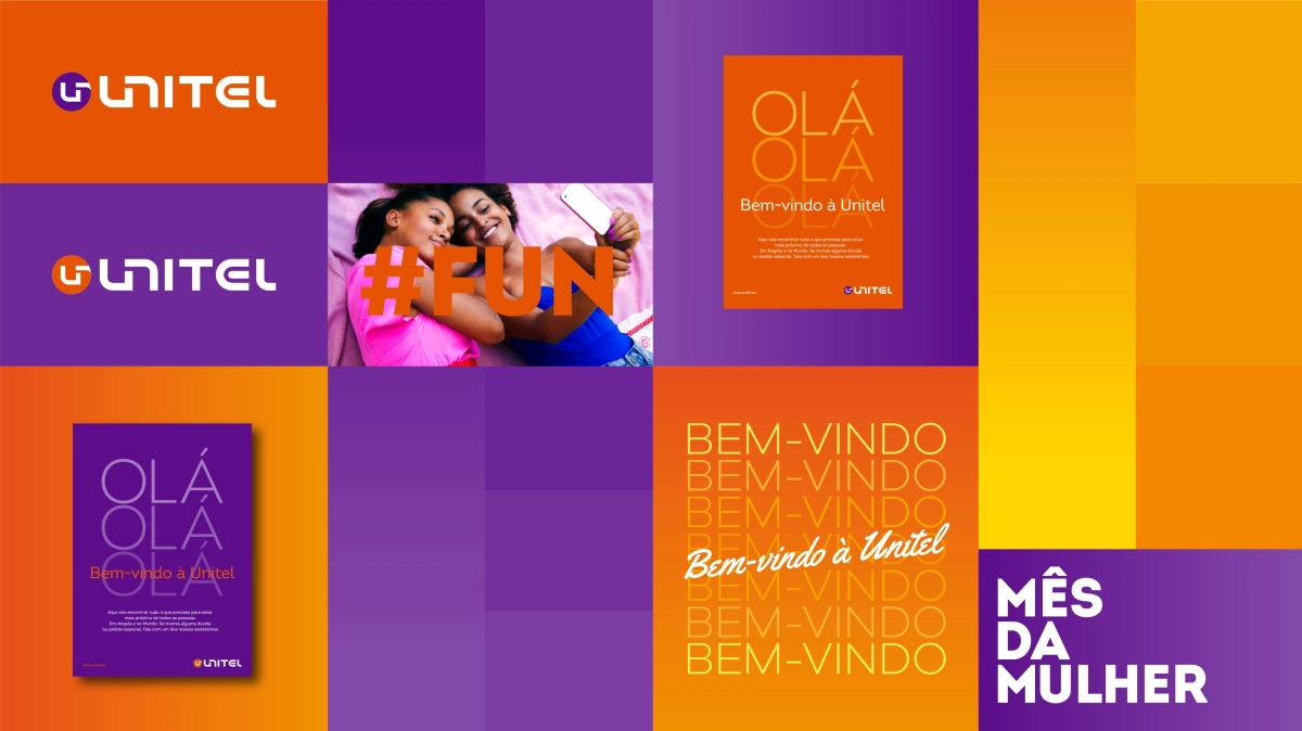
We analysed the brand's heritage—its typographic, photographic, and chromatic assets—and made tactical updates that balanced its history with future aspirations. The refresh focused on creating a more organised and cohesive use of the brand across multiple platforms.
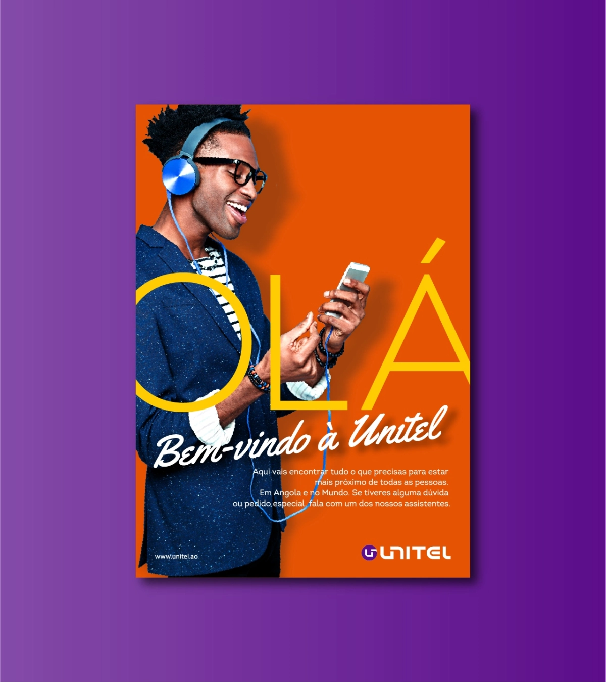
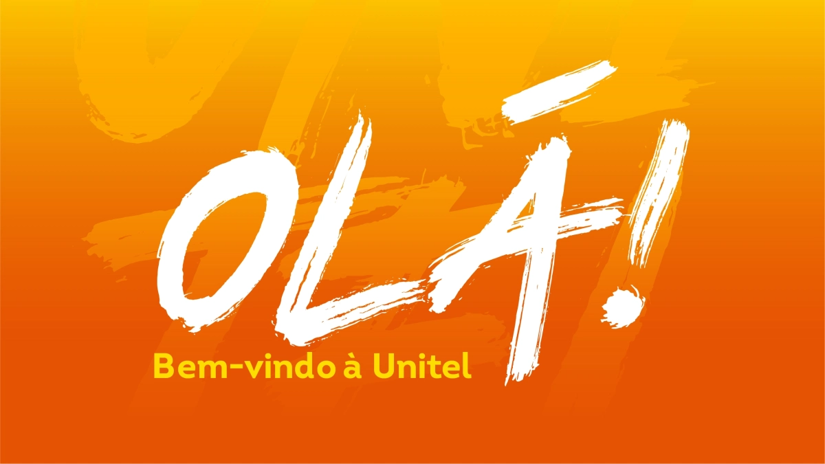
We introduced a new colour palette inspired by Unitel's original colours to infuse more energy into the brand and adjusted the typography for better harmony between the text and symbol. Additionally, we modernised the photographic universe to align Unitel’s communications with global telecommunications industry standards.
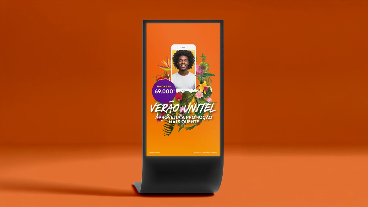
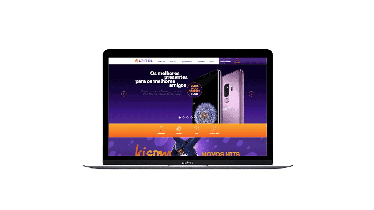
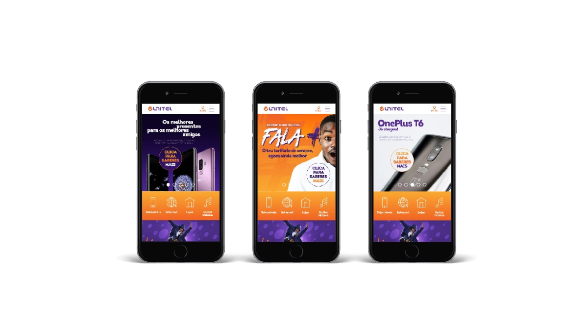
Our approach to the brand refresh was rooted in preserving Unitel's legacy while modernising key elements to reflect its growth.
Impact.
The refreshed brand was designed to strengthen Unitel's position both institutionally and across its B2C and B2B segments. By ensuring a more cohesive and impactful brand expression, the project helped Unitel continue its role as a key player in Angola’s telecommunications sector while reinforcing its identity as a symbol of development, technology, and national unity. This refresh gave Unitel the tools to maintain its strong customer relationship and deepen its engagement in the digital era.
